

A Floral Arrangement Preview App for Buds & Branches - Case Study
The product:
Buds & Branches is a networked florist in a Houston, Texas suburb. They have a great reputation for quality, high-end floral designs. They have busy professionals and those on a budget in their customer base. They want to understand what they are purchasing so that they can be confident in their purchase.
Project duration June 2021 - February 2022
Tools: Adobe Creative Suite, Figma, Miro, pen and paper
Project overview
The problem:
Users want to know what they have purchased and when the arrangement will be delivered to the recipient. They want an quick and easy way to purchase and know the arrangement will fit their taste and budget.
The goal:
Design a floral arrangement preview app to help our users understand the arrangements they purchase. Providing education, variety and choices that will help the user send gifts to friends and family.
My role:
UX Visual Designer and Researcher designing an app for Buds & Branches from conception to delivery. Conducting interviews, included user research, paper and digital wireframing, low and high-fidelity prototyping, conducting usability studies, accounting for accessibility, mockups, and iterating on designs.
Understanding the user
User research summary
I conducted interviews and created an aggregated empathy map to identify and understand the users I was designing for and their needs, goals and frustrations. The primary users of our app was working adults with excess income who like to send flowers as gifts.
Through my research, I was able to confirm our initial assumption, but we also included users on a budget that rarely send flowers to reach a broader audience. Other user challenges that affect my design include user concerns about value for the price, the ability to customize arrangements, and being able to purchase with short notice for set delivery windows.
-
The preview app should give information about the arrangements and how to prolong the life of your flowers
-
The preview app should have a wide variety of flower arrangements to select from and provide customization options
-
The selections of flowers should be able to be delivered quickly within a selected delivery window and the user should receive confirmation
-
The app should have information about the individual flowers as well as meanings/ symbolism and season it’s available

Problem statement:
Nathan is a busy college professor who likes to give flowers and needs to be able to understand what he is buying and when it will be delivered because he wants to know he’s getting value, quality, and lasting floral arrangements.

Mapping Nathan’s journey reinforced the app goals of providing previews of floral arrangements
quickly and efficiently ordering of flowers
lack of floral knowledge
ordering arrangements based on images

Affinity diagram
Beginning the design
Paper wireframes · Digital wireframes · Low-fidelity prototype · Usability studies

Paper wireframes
My goal for the Home screen was to establish branding and draw users into Buds & Branches to preview arrangements. The menus available provide several ways to order quickly or find additional information to provide user confidence and save time.
Digital wireframes

Home screen

Custom arrangement screen

Best seller screen
My goal for the Home screen was to establish branding and draw users into Buds & Branches to preview arrangements. The menus available provide several ways to order quickly or find additional information to provide user confidence and save time.
My goal with the Custom screen was to provide users with elements they could select to create an arrangement. If they needed help understanding particular flowers or elements the About Flowers menu has a directory with additional information including cost, seasonality, symbolism.
Based on my information and research so far I believed a Best Seller menu from the home page would be important for users that want to pick arrangements quickly and feel confident they had selected something popular.
Low-fidelity prototype
The primary user flow begins at the home page with selecting Best Seller, About Flowers, or Custom. The best seller and custom menu items bring the user to arrangements they can select and purchase. The about flowers menu give users more information and details about elements of arrangements.

Two Moderated Usability Studies
Study type: Two rounds of moderated usability studies with system usability scale questionnaire afterwards. We would like to learn how users complete core tasks in the app and successfully order flowers feeling confident in their purchase. Findings from the first study helped guide the designs from wireframes to mockups. The second study used a high-fidelity prototype and revealed what aspects of the mockups needed refining.
Participants: People who have sent flowers as a gift and live within 25 miles of a florist network. Two males, three females aged 15 to 65 years old - one user with limited hearing and one with limited vision
Interview format 10 - 20 minutes Seattle, Washington USA
-
Some users purchase flowers by picture only and need additional/larger images
Users had difficulty navigating from the home page to select an arrangement and labeling was confusing
Users would like to exclude colors or flowers from their custom order
The “Custom” menu was difficult for users to navigate
-
Pictures and visuals are very important to users and need to be large
Relabeling button terminology provided more understanding for users
“Similar Arrangements” options are important to users in all of the menus
The “Custom Arrangement” menu is too limited for users

Custom arrangement screen

Custom arrangement detail screen

Add on screen


Cart
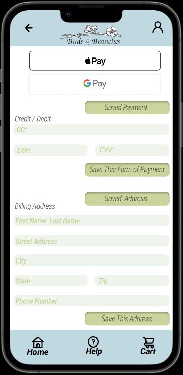
Payment screen

Thank you screen

Home screen
High-fidelity prototype
The final high-fidelity prototype presented three menus to preview arrangements and a user flow for the help menu. It met users needs for feeling confident about their purchase by offering detail and large pictures.

Accessibility considerations
We considered text size and color while designing our app for accessibility. Minimizing text and adding alt text to images is an additional benefit for screen readers.
Used detailed and larger images for accessibility consideration while designing which benefits those without floral knowledge or users that purchase by pictures.
We considered color while designing our app for accessibility. Higher contrasting colors and icons improve the designs.
Going forward
Impact:
All users in our studies communicated that they would use this app to preview and purchase floral arrangements. They found the process quick and convenient especially in our second usability study.
“"This is handy especially for someone like me who doesn't know about many flowers" - Eric
What I learned:
My assumptions as a designer and researcher gave me a starting point, but my designs and iterations were improved with the perspective of others through the usability studies and peer feedback. Those insights guided iterations and resulted in a better design.
Next Steps
-
Recommend we continue to develop this app for accessibility to increase usability. This additional effort will help all users.
-
Photography of arrangements and individual elements are of significant importance to users. Recommendations include a scale reference and white background for usability, clarity and contrast.
-
Further development of functionality of the app including: users account set up, text throughout, Buds & Branches business history, and reviews from customers.